
Create a font using Illustrator and FontLab – tutorial part 1
Part 1 of 2 This video takes you step by step through the process of setting up Illustrator so you can easily transfer artwork across to FontLab Studio 5. Watch part 2: www.youtube.com – – – – – – NOTE – – – – – – For those of you using a version of Illustrator CS5 or above, please be aware that Adobe changed the way the rulers work. Instead of 1st quadrant rulers, CS5 and above now use 4th quadrant rulers. What does this mean? It means that values taken from the Y axis (up and down) will be reversed. All numbers that you want to be positive (above the baseline) will be negative, and all numbers which you want to be negative (below the baseline, descenders) will be positive. Argh! Quick fix: Simply swap positive numbers to be negative, and vice versa. So if you get an x-height value of -300pt (using 4th quadrant rulers) just change it to positive before you enter the value into FontLab, ie 300pt. Easy peasy! 🙂 Long and detailed explanation: blogs.adobe.com Subscribe to my channel: www.youtube.com
Video Tutorial Rating: 4 / 5
Don’t forget to check out our other video tutorials or share this video with a friend.
 0 votes
19 responses to “Create a font using Illustrator and FontLab – tutorial part 1”
Leave a Reply to Philippa Berry Smith Cancel reply
Video Tutorials
Bringing you the best video tutorials for Photoshop, Illustrator, Fireworks, WordPress, CSS and others.
Video tutorial posted 01/02/13

Pages
Random Videos
![Photoshop tutorial: Lomo effect. Quick n’ easy [HD]](http://www.videotutorials.co.uk/wp-content/uploads/2013/11/16814_photoshop_tutorial_default.jpg)


Video Categories
- 3DS Max Tutorials (150)
- After Effects Tutorials (160)
- C# Tutorials (121)
- Colour (6)
- Crazy Effects (1)
- CSS Tutorials (120)
- Dreamweaver Tutorials (139)
- Excel Tutorials (127)
- Featured (10)
- Fireworks Tutorials (131)
- General Effects (9)
- HTML Tutorials (143)
- Illustration and Vector (1)
- Illustrator Tutorials (174)
- IMove Tutorials (119)
- Lightroom Tutorials (145)
- People and Faces (3)
- Photoshop Tutorials (169)
- Text Effects (7)
- Uncategorized (32)
- WordPress Tutorials (140)
Tags
VideoTutorials.co.uk
-
Videotutorials.co.uk offers the web's best Photoshop tutorials, Illustrator video guides, CSS and HTML tutorials and much more all in one place. With new videos being added every day, you can learn how to master software and code to give your images and website some great effects.
Our site has beginner, intermediate and advanced video tutorials of varying lengths so you can learn a new skill at your own speed and level. So whether you're a web designer, print designer or just wanting to edit some family photos, you can get to it quickly and easily using these free video guides. (more)
Hi tothprod, yup I knew that one, it’s just old habits die hard! I was taught to do keyboard shortcuts to speed my workflow, and so now I find myself preferring them (even it, as you pointed out, they are slower lol). 🙂
Thanks for the tutorial 😉 Little tip, don’t know if you know this one yet. but when you select an object, and create a new layer, you can just drag the little color square on the right in your layers panel to the new layer. That moves everything you selected to the new layer. That save a copy/paste command, and is much faster.
Hi Dusan, sorry I’ve never experienced that issue myself. But maybe it could be something to do with the key dimensions going awry? You could try copying the glyph into a new character slot (so when you export you have original and new glyphs) and see if you can spot what is going wrong. Might be worth downloading the FL manual from their website and having a trawl through to see if you can find the answer. Without more detail I can’t offer any more suggestions sorry. Hope you find a resolution.
Hi Eliza, yes, still doing comments 🙂 There is nothing to stop you putting every glyph in the same illustrator document. Perhaps only if you find your computer is not speedy/powerful enough then I would consider splitting into several smaller files. Either way. I normally do one file to uppercase, one for lowercase, one for numerals, one for italic, one for bold etc. Yes, I’m from New Zealand - good ears! 😀
Don’t know if you are still receiving comments, but….if you have 26 letters in illustrator…do you just put them on 26 layers? or fewer per document?
thanks, good tutorial….and new zealand am i hearing? thanks, eliza
Hello Philippa, thanks for the good tutorial. I was wondering if you could help me with a font scaling issue. I am trying to edit an existing font. I modify a certain character in Fontlab Studio’s Glyph window, for example move some dots to make in narower. Then I generate font and apply it. What happens is that now this character seems to scale diferently than other characters. It gets shorter even though it has the same height as others.
Hi Rain, you only need to do enough letters so you get the following dimensions: cap height, ascender, x-height, [baseline always = 0], and descender. So, usually setting guides for four letters is fine. If you have a typeface design that has variable heights for, say, the ascender, then I would put guides on several and use the guide that falls in the middle. Most typeface designs have consistent dimensions where every ascender goes to the same height, for example. Hope this helps. 🙂
Hey Philippa, Do I need to set my guides for all the letters or will only these four be enough?
Cool :)
thanks a lot…got it very clear… 🙂
Thanks!
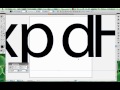
Hi Nahid, I had 2 reasons: first, I am only looking for vertical measurements, and that selection of letters contains a descender, an ascender, a cap, and the x height. I can get the main dimensions from these four letters alone. The second reason is time: it actually takes hours and hours to do the entire alphabet, so I sped up the process for the audience 😛 Hope this helps clarify things for you 🙂
i have a very basic question…as i’m new to create font, so don’t get bother please.
why did you use only x p d & H letter in the process ? why not the other letters ? i read all of your comments but couldn’t find the answer. 🙁
that’s awesome!!
Cool you’re welcome Oscar 🙂
Problem solved, thanks a lot Philippa :)
Hi Oscar, yes there is a solution to this: you need to set your rulers in Illustrator to be Global Rulers, and you need to swap the vertical metrics values so that all values above the baseline are negative and all values below baseline are positive – counter-intuitive I know. It’s because Adobe changed how the rulers work. More details available in the notes under the video 🙂 Hope this helps
Hello, i’m having a little problem when pasting the letter in font lab, in the video when you paste it it automatically paste it in place in the base line, when i paste it , the whole letter is pasted below the D line…any solution to this? thank you!
Yup :)