
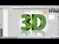
Illustrator Tutorial – Creating a basic logo design

Adobe Illustrator Tutorial – Creating a basic logo design. This will teach you some basic things in Illustrator – using clipping masks, compound paths and more.
Video Tutorial Rating: 4 / 5
Don’t forget to check out our other video tutorials or share this video with a friend.
 0 votes
24 responses to “Illustrator Tutorial – Creating a basic logo design”
Leave a Reply
Video Tutorials
Bringing you the best video tutorials for Photoshop, Illustrator, Fireworks, WordPress, CSS and others.
Video tutorial posted 28/04/13
Category: Illustrator Tutorials

Pages
Random Videos


Video Categories
- 3DS Max Tutorials (150)
- After Effects Tutorials (160)
- C# Tutorials (121)
- Colour (6)
- Crazy Effects (1)
- CSS Tutorials (120)
- Dreamweaver Tutorials (139)
- Excel Tutorials (127)
- Featured (10)
- Fireworks Tutorials (131)
- General Effects (9)
- HTML Tutorials (143)
- Illustration and Vector (1)
- Illustrator Tutorials (174)
- IMove Tutorials (119)
- Lightroom Tutorials (145)
- People and Faces (3)
- Photoshop Tutorials (169)
- Text Effects (7)
- Uncategorized (32)
- WordPress Tutorials (140)
Tags
VideoTutorials.co.uk
-
Videotutorials.co.uk offers the web's best Photoshop tutorials, Illustrator video guides, CSS and HTML tutorials and much more all in one place. With new videos being added every day, you can learn how to master software and code to give your images and website some great effects.
Our site has beginner, intermediate and advanced video tutorials of varying lengths so you can learn a new skill at your own speed and level. So whether you're a web designer, print designer or just wanting to edit some family photos, you can get to it quickly and easily using these free video guides. (more)
I’ll work on a compound path tutorial next…basically, if you have several objects selected and you use the command “object – compound path – make”, it makes one object out of all of them.
I added a link to a tutorial explaining the basics of clipping masks in the description above. I’ll be working on a tutorial for compound paths soon.
I added a link to a tutorial explaining the basics of clipping masks in the description above. I’ll be working on a tutorial for compound paths soon.
I added a link to a tutorial explaining the basics of clipping masks in the description above. I’ll be working on a tutorial for compound paths soon.
Hey I love this tutorial, its just what I was looking for! thank you thank you thank you! But I have a question though, whenever I try to do the Highlight…the Compound Path doesn’t give me the same gradient color I picked. It takes out the color and shows the second layer color…can you help please?
The mask portion is where things go haywire! I have three layers of color. I have tried pushing shortcuts, rearranging, and watching tutorials to bring me up to speed with your video. Each time I end up with (1) white text (nothing), (2) red text, or (3) text clipped only inside of the gradient section. I have successfully done a clipping mask on the full text. Please explain how to do a partial mask. Thanks!
I am going to design a nice logo from now
Thanx
I will work on a new tutorial to explain this better.
I’ll work on a new tutorial that explains, more slowly, some of the concepts. Sorry, I know it’s confusing…my apologies.
you’re welcome!
in the menu bar at the top, select “OBJECT”, “PATH”, “OFFSET PATH”, then adjust your value, either positive for an outward offset, or negative for an inward offset. The default offset is 0.1389 inches which, depending on your zoom level, you might not see the offset if you’re working on a really tiny object.
sorry about that. i’ll consider that for the next tutorial. if you have specific questions about any of what i did, hit me, up, i’m glad to help. btw, i’m not a kid…i’ve been using Illustrator since .88…but thanks for the compliment…no excuse for hurrying through a tutorial, however, i’ve been doing this so long it’s second nature and sometimes I forget.
kid you’re working WAY too fast slow down, you just do shit without explaining anything
i DID not understand about the offset path its not working in my software why?
I had this down just fine till you used the pen tool and gradient. You need to explain how to do each thing for those that are beginners – it’s tedious I know, but you are making a tutorial, which needs every detail explained despite how mundane it may be. Tutorial is good otherwise, thank you for posting it.
thank you
hmmmmmmmmm
3:32 how to make this ( Mask) ??
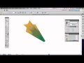
outline the text (shift+ctrl+o or shift+cmd+o) then make the text a compound path (ctrl+8 or cmd+8) – yeah, the fill will go away but the outlines for the text are still there. make sure the text is above the gradient. select the text and the gradient and press ctrl+7 or cmd+7 to use the text as a clipping mask for the gradient.
at 4:20 when you r explaining the way you merge the two objects, the text that is not on top of the shape disappears, i have had that same problem when using this technique and i don’t get a merge of the 2 colours. What I’m i doing wrong?
he does not explain precisely, shortcut shortcut!!!!
ok I got it, I forgot to hit the control shift O (where can we see that in the tope menu?)
in the video at 3:20 – you use the shape of the letters to “mask off” the gradient. select two objects that overlap and hit ctrl-7 (pc) or cmd-7 (mac) to create the compound path from the two objects. I should have said “clipping mask”.