
Excel Dashboards with PowerPivot Tutorial
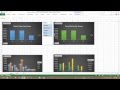
Quick intro to how to take your own data and quickly turn it into great presentations, charts, and dashboards, using the PowerPivot feature of Excel. This is…
Don’t forget to check out our other video tutorials or share this video with a friend.
 0 votes
4 responses to “Excel Dashboards with PowerPivot Tutorial”
Leave a Reply to Clay Rembert Cancel reply
Video Tutorials
Bringing you the best video tutorials for Photoshop, Illustrator, Fireworks, WordPress, CSS and others.
Video tutorial posted 06/09/13
Category: Excel Tutorials
Tags: Dashboards, Excel, PowerPivot, Tutorial

Pages
Random Videos
-
HTML Tutorial 4 – Image Mapping (Beginners)
2,302 views
-

Learn to Code 2013: HTML Tutorial #1
4,471 views
-

-
Video Categories
- 3DS Max Tutorials (150)
- After Effects Tutorials (160)
- C# Tutorials (121)
- Colour (6)
- Crazy Effects (1)
- CSS Tutorials (120)
- Dreamweaver Tutorials (139)
- Excel Tutorials (127)
- Featured (10)
- Fireworks Tutorials (131)
- General Effects (9)
- HTML Tutorials (143)
- Illustration and Vector (1)
- Illustrator Tutorials (174)
- IMove Tutorials (119)
- Lightroom Tutorials (145)
- People and Faces (3)
- Photoshop Tutorials (169)
- Text Effects (7)
- Uncategorized (32)
- WordPress Tutorials (140)
Tags
VideoTutorials.co.uk
-
Videotutorials.co.uk offers the web's best Photoshop tutorials, Illustrator video guides, CSS and HTML tutorials and much more all in one place. With new videos being added every day, you can learn how to master software and code to give your images and website some great effects.
Our site has beginner, intermediate and advanced video tutorials of varying lengths so you can learn a new skill at your own speed and level. So whether you're a web designer, print designer or just wanting to edit some family photos, you can get to it quickly and easily using these free video guides. (more)
Hi Edward,
Your explanation and demonstration is phenomenal! The instruction is clear, concise and easy to follow. Your teaching style is one of the best I’ve experienced…thank you!
v good
when I select my data I get this note: what do I do?
The selected range is invalid. Select a valid range. A table cannot overlap a range that contains a PivotTable report, query results, protected cells or another table.
Very nice presentation. Clear and concise. Someone unfamiliar with this tool would have no problem using this tutorial and create their own products.
I also like the additional feature you get on these dashboards as it’s easy to link a single slicers across all (or some) of the charts. A single slicer can then control the information being presented in one or all the charts.